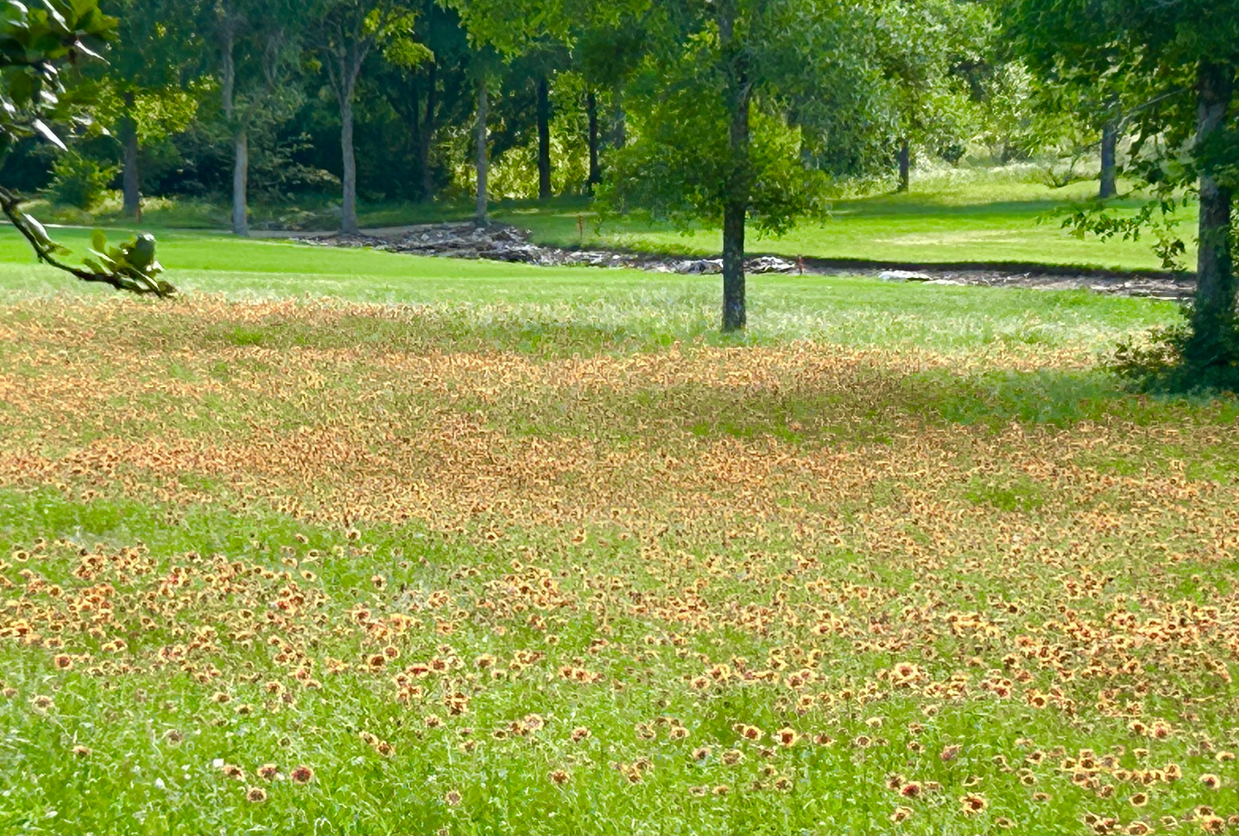
Happy May everyone! Can you believe how fast this year is going by and that we are well on our way to summer? Crazy! But summer means many good things, one of which is flowers! I love flowers. I am by no means a green thumb but I do love flowers, especially my two favorites: daisies and Easter Lilies. Daisies are so simple and cheerful and Easter Lilies represent so much and smell so good. I also love Texas wildflowers and boy are we having a season this year! The photo above is from our backyard as I write this.
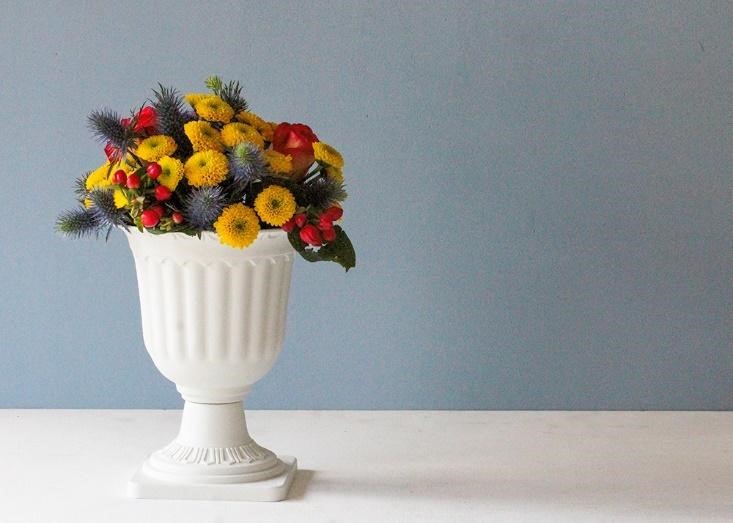
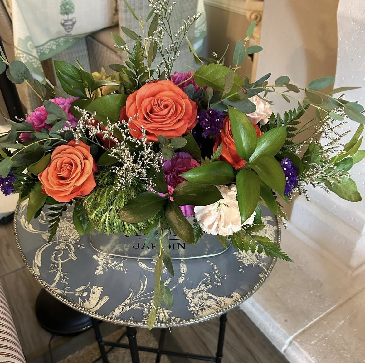 The photo above is an arrangement I made during a recent flower arranging class courtesy Bunches of Charm Floral Design. I went in knowing zero about the topic but I’m good at following directions and I love a pretty vase of flowers so this class was right up my alley.
 And, although it’s past Easter (but still Easter Season in church) and my Easter Lily from this year is now lovingly planted in a flower bed, I also recently watched a Hallmark movie (yes, I love them) called “An Easter Bloom” about a gardener who sets out to save her family farm by entering a floral competition for Easter. Spoiler alert: yes, she saves the farm, wins the contest, and falls in love! During the movie, a seasoned florist at one point tells her the four principles of floral design: harmony, contrast, purpose, and balance. It all made sense to me and piqued my interest. I wasn’t sure if this was accurate or just “Hallmarky” so I delved deeper.
Present Season
Enter Wendy Mouton of Petal Republic who is quite versed in the area and says understanding the principles of floral design is the first step to creating beautiful arrangements. As with most rules, these guidelines are somewhat made to be broken depending on the arrangement’s purpose and supplies available, but you can’t follow or break rules without knowing them, right?
Petal Republic
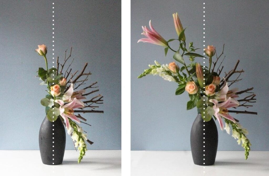
First for Mouton is Balance. An arrangement that’s top or bottom heavy or flat-out lopsided has balance issues, and I’m not talking because they were over-served. The key to achieving balance here is to use the horizontal and vertical lines of it as a guide. It’s easy, simply hold up a pencil in front of an arrangement in the center and determine if both sides are even and does each side attract equal attention? Keep in mind that larger flowers and shapes attract the eye more than smaller ones and warm or brighter colors attract the eye more than cool or dull colors. (More about colors below.)
Petal Republic
Next up: Focal Point. This is a piece in the arrangement that draws the eye and anchors the design. This could be a large flower, which should always be placed just above the edge of the container leaving the outside for more delicate and wispy materials, or even a balloon or stuffed animal.
Petal Republic
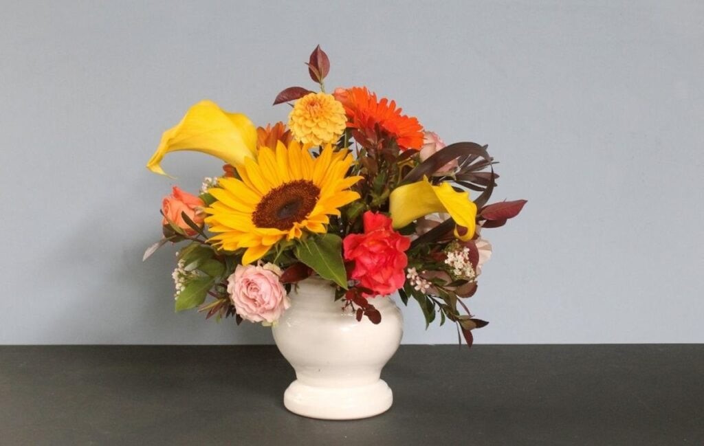
Accent and Emphasis are closely related to Focal Point and are generally the main cast members of a floral arrangement. These should be large flowers but not too many, shapes that create interest points, bright colors, and shiny textures.
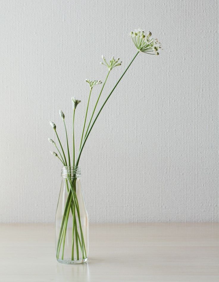 Like a good musical piece, a good floral arrangement needs Rhythm and repetition offers just the right beat. Examples could be long and tall plants or flowers in a long and tall vase or a variation of the same color scattered throughout the design. Also, always use more than one of any type of plant or material and arrange them by thinking of a tree’s natural design: the trunk is broad and the branches generally get smaller as you move up the tree. In a flower arrangement, this type of transition works well by starting with the bigger and more compact middle and moving outward to smaller twigs and leafy materials to create rhythm and flow. Curves, of course, also create rhythm and curved plants are also playful and whimsical. When it comes to transition, color can also create rhythm by using a bridging color between two other colors such as using an orange flower between a yellow and red one.
Petal Republic
Here’s where we bring in color as we talk about Contrast. One of the easiest ways to add contrast is with color and by making use of the color wheel. In case you’ve forgotten your elementary school color wheel, here’s a reminder:
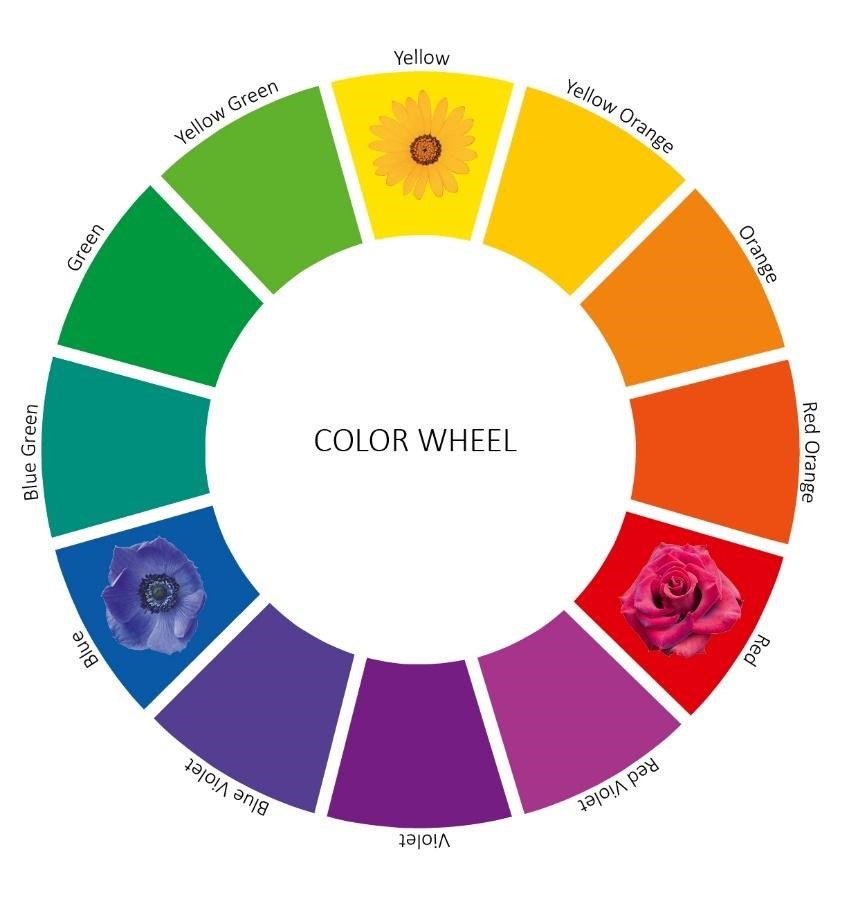 In general, colors across the color wheel add instant contrast with the cornerstone Primary Colors of red, yellow, and blue adding the brightest and most vibrant punch that all work well together for a high-contrast grouping. The Secondary Colors of green, orange, and violet (or purple) are opposite the Primary Colors and mix well with their bigger and brighter brothers.
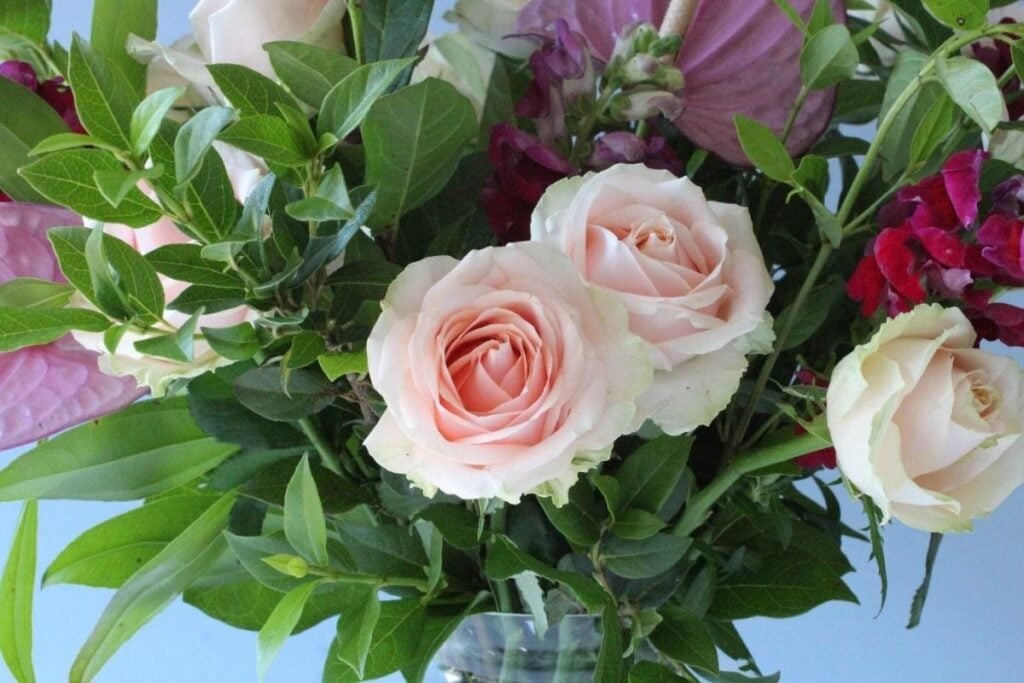
 Lastly and perfectly, there’s Harmony. It just sounds pretty, right? Things that create harmony include repetition, texture, and using shapes, whether your arrangement is for in the kitchen or out on the porch. For example, match the color of the vase to the colors in the flowers and just for fun, sing while you’re doing it!
The Inspired Room
Okay, so maybe there’s more to floral design then depicted in the Hallmark movie, but isn’t that the norm? Things don’t always end up happily every after but if you follow even most of these guidelines, I’m confident you’ll be pretty happy with your creation. Even after it’s long gone.
Discover more from Beyond Words
Subscribe to get the latest posts sent to your email.
