Beyond Words

Words, Wit and Wisdom for Today's Style and Decision Makers

The Lips Have It July 28, 2018

Filed under: Uncategorized — carlawordsmithblog @ 7:56 pm

Do you know what today is? Yes, it’s Saturday and yes it’s July 29, but did you know it’s also National Lipstick Day? Funny right, but fun too!


Lipstick is big business so it should come as no surprise that the industry not only endorses but embraces a national day of its product. Lip color is actually the third most popular cosmetic product, behind foundation and mascara, generating nearly $627 million in revenue in the U.S. alone. That’s a lot of mattes and glosses.


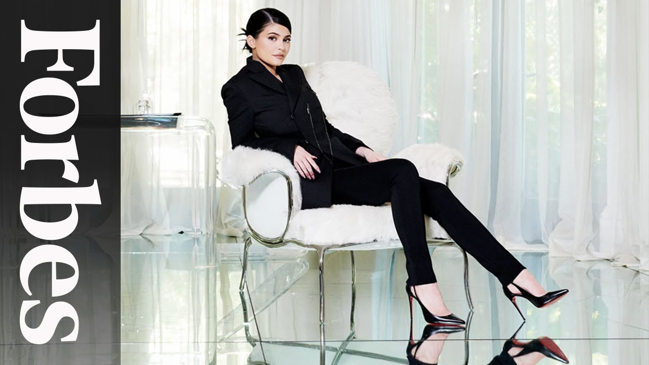
If you have any doubts of its popularity, I present none other than Kylie Jenner. According to Forbes magazine, the 20-year-old of Kardashian family fame is on track to dethrone Facebook’s Mark Zuckerberg as the youngest self-made billionaire. Ever. All thanks to a lip kit.


I realize, as does anyone who can live and breathe, that calling Jenner “self-made” is a huge stretch, but considering she launched her Kylie Cosmetics in 2016 and today her net worth is $900 million, credit is due. If she reaches billionaire status in the next two years, and most experts predict that will happen by year’s end, she will indeed wear the “youngest billionaire ever” crown, beating the face of Facebook’s 23 with her 21.


One more interesting tidbit about Kylie: you won’t see any TV or print advertising for her billion dollar brand, which adds even more level of amazing to her amazing meteoric rise. Her products are instead marketed primarily through her and her family’s social media sites…for free. Some industry analysts say the exposure of her products to her 110 million Instagram followers alone is worth $1 million in traditional advertising spending. That’s $1 million she’s keeping right in her pocket.


Okay, but enough about Kylie. Let’s talk lipstick starting with creating a solid and flattering lipstick wardrobe for yourself.


Perhaps most important is matching any lip shade you pick with your skin undertone. Warm skin tones should wear orange-reds, brick reds, peaches, peachy pinks, and corals. Those with cool undertones look best in blue-reds, cranberry, wine, pink reds, and rosy pinks. From there, it’s up to you as to what style of a lip color you prefer.


You might like traditional lipsticks or you may prefer lip glosses. Maybe you like a matte finish and not so much a glossy look. Whatever variety or brand, every woman should have three lip colors in her cosmetics collection: a versatile nude, a classic red, and a nice pink.


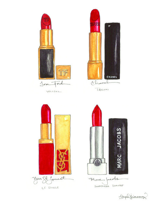
My go-to and basic nude lipstick has forever been “Apricot Glaze” Crème Lipstick by Mary Kay but the color was recently discontinued. Can I just say, why do manufacturers do this? Do they enjoy aggravating their loyal customers and see them walk away, which is what I’ve done in search of a nude. Yep, I’ve headed right off my computer and straight into Sephora for the Girl Lip Stylo in “Peacemaker.” Take that MK! Other popular nudes are Tom Ford’s “Sable Smoke,” Mac’s “Love Child,” Chanel’s “Coco,” and Maybelline’s “Almond Rose,” of which more than 25 tubes are sold every hour.


Reds are a whole different ball game. I really don’t like the way I look in a bright red lip and I don’t like the “look at me, look at me” image it evokes. My personal favorite red? Chanel’s shimmery and high-shine Rouge Coco lip gloss in “Amarena” that is shimmery but still subtle. Another fave is Mary Kay’s “Toffee,” which can go red, coral, and even a darker neutral. “Toffee” actually used to be my go-to nude and all-around go-to lip color, but as I’ve gotten older I find it a bit too harsh and not quite as neutral as I’d like…hence the discovery of “Apricot Glaze” and now “Peacemaker.”


Popular reds are Revlon’s “Fire and Ice,” which actually boasts SPF15, and Chanel’s trademark “Allure.” In general, cool undertones are complimented by blue-based red lipsticks like cranberry and wine, while warm undertoned ladies look best in orange-reds and brick reds. Here’s a good example of both:


Both the above lipsticks are considered “reds,” but the one on the left is a “cool” red while the one on the right is a “warm” red.


Have fun with reds and don’t be afraid to add some drama to your look with them, but despite what many women believe, a bold lip is not always the most attractive the older you get. Younger women can rock a red to no end, but with more mature ladies, sometimes it’s best to just play it safe and play it down.


Pinks are a good way to do this while still adding color. I love MK’s “Dusty Rose” and Revlon’s “Soft Shell Pink” is an enduring darling. Chanel also has some pretty pinks in their Rouge Coco line and Marc Jacob’s “Kiss Kiss Bang Bang” is not only fun to ask for at the cosmetic counter, it’s a great color! On the more berry end of pinks are Avon’s popular “Cherry Jubilee” and Clinique’s “Black Honey,” one tube of which is sold every three minutes in the U.S. With all pinks, pick a more sheer one if you’re fair-skinned and more opaque if you’re darker skinned.


I almost always wear some type of lip product. For running errands I opt for a cream lipstick, going out I go with a gloss, and I always have a lip balm nearby. I actually have lip balms everywhere: in my purse, in my car, at my desk, at work, in my nightstand…everywhere. I cannot stand a dry or bare lip. And, true confession, I also have a few Kylie Cosmetics lip products. After seeing how fabulous the ones that my daughter has were, I caved. I will say her matte liquid lipstick stays on for-ev-er, although it is a bit sticky and drying, but her gloss is equally as fab and not drying. Maybe the little billionaire is actually on to something!


As I mentioned above, lip products are big business and many brands are expensive. If you’re looking for an affordable lip gloss, check out both the soft matte lip cream and the lip lustre styles by NYX, found everywhere. They last for hours and the lip lustre is super shiny but moist.


But, how do you make a lipstick last longer after applying it? This used to be a bigger dilemma than it is now due to so many new products boasting “long lasting” and “lip stain” formulas. A true test of this is when you take a drink of something. If your lip color doesn’t show up on the rim of the glass or cup, it’s a keeper. If you have a lip product you adore but it isn’t one that stays on, here are some tricks of the trade you can try.


  • Makeup artist and Chanel brand ambassador Kate Lee recommends using “velvet” lipsticks, which give you a matte look but also have emollients. She also suggests first applying a lip balm and letting it sit for 10 minutes before applying your color of choice.


  • Most experts agree you should apply your lip color straight from the tube or case and only use a brush to blend after application and to define and fill in your lips with a liner in the same shade as your lipstick.


  • You can also try prepping your lips by exfoliating them with a sugar scrub of sugar and Vaseline and also blot away excess lip color after applying.


  • Another trick comes from none other than singer Celine Dion, who swears by dabbing a hint of foundation on her lips before applying color.


Or, you can just keep reapplying like I do, but whatever you do, don’t stress about full-lips or lack thereof. The pressure seems to be that one must have full-lips and if you don’t, get some. To me, whether you’re Kylie Jenner or Jane Doe, fake lips simply look fake. No one ever thinks, “Wow, her injected lips are great!” They more than likely think, “Wow, she got new fake lips.” Ironically, I’ve read that Kylie is swearing off the over-filled and uber-fake lips that she is so known for. I guess you don’t always have to dance with what brung you.


Interestingly enough, a recent study revealed that lip size is insignificant when it comes to perception of attractiveness. What really seems to matter is pigment. This means if you have natural lips with a pretty rosy pigment, they are considered much more attractive than any lips full of fillers of any color. So, unless you’re born with full lips, just accept your God-given ones and work with them.


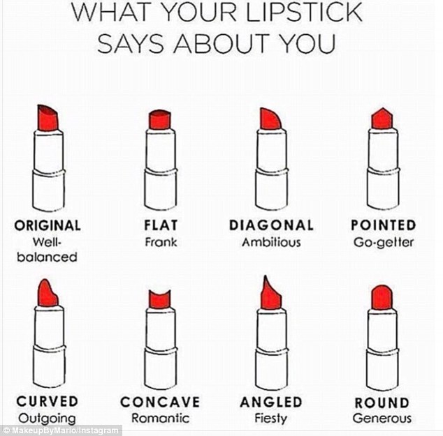
Finally, and just for fun, here’s a chart of what your lipstick shape reveals about your personality. Which one are you?


I Scream, You Scream July 15, 2018

Filed under: Uncategorized — carlawordsmithblog @ 10:29 pm


Happy National Ice Cream Day! Although I rarely eat it or buy it, what better way to cool off during this long, hot summer then with a big bowl of Butter Pecan or Cookies and Cream? Today there are many versions and flavors of ice cream, but according to the International Dairy Foods Association, that hasn’t always been the case.


The origins of ice cream go waaaaay back and it could be said they are biblical. There are mentions of a B.C. ice cream, with references of King Solomon loving his iced drinks. Still, no specific date or inventor is credited with its discovery. Alexander the Great is known to have enjoyed snow and ice flavored with honey and nectar and during the Roman Empire, Caesar sent workers into the mountains to retrieve snow, which he would later flavor with fruits and juices.


That’s about all we know until more than 1,000 years later, when Marco Polo returned to Italy from the Far East with a recipe that resembled what we call sherbet today. Various countries contend for the actual title of “ice cream inventor,” with England claiming to have done so in the 16th century and France introducing frozen desserts in 1553, but it wasn’t until ice cream was available to the general public in a café in Paris that you could say it went viral in a very primitive kind of way.


The U.S. was a bit slower in its love for and discovery of a bowl of frozen anything.  Ice cream was first advertised in America in the “New York Gazette” in 1777, but the first official account of ice cream stateside came in a letter written in 1744 by a guest of Maryland’s governor. He wasn’t the only statesman to favor the dessert. Inventory records of Mount Vernon revealed two pewter ice cream pots belonging to George Washington and none other than Dolley Madison is known to have served a strawberry version at President Madison’s second inaugural ball.


Ice cream remained an elite confection until around 1800 when insulated ice cream houses were invented. By 1851, the manufacturing revolution changed not only America as a whole, but the ice cream industry as well. Steam power, mechanical refrigeration, the homogenizer, electric powered motors, new freezing processes, and motorized delivery all contributed to bringing ice cream to the masses. Today Americans serve up more than 1.6 billion gallons of Haagen Dazs, Blue Bell, and every brand in between.


The dessert’s growing popularity also led to offshoot enterprises, including the quintessential American soda fountain shop and its quickly popular ice cream soda. Think 1950s and you think soda fountain: cute little counter seats all lined up and white-attired staff waiting to serve you. You don’t get any more American than that.


Still, some protested and their grievances resulted in a dessert concoction that even I can’t resist: the ice cream sundae. When religious leaders complained about congregations partaking in what they called “sinfully rich sodas” on Sundays, ice cream merchants responded by eliminating the carbonated water from the dessert and the name was later changed to “sundae” to remove any connection to the Sabbath. I did not know this!


World War II is also historically rich with ice cream legend. Apparently each branch of the military raced to outdo each other in serving ice cream to the troops. When the war ended, dairy rationing was lifted and America celebrated the victory in many ways, including with ice cream. Maybe that’s where “I scream, you scream” came from!


It didn’t take long for retailers to take note and more and more prepackaged ice cream was sold in supermarkets. Sadly, this commercial renaissance coincided with the slow but steady disappearance of ice cream parlors and soda fountains but ice cream stores could be found on every corner. One of my happiest childhood memories was my mom and dad packing my two sisters and me in the car and heading to Baskin Robbins for our pick of one of their 31 flavors. And despite the bad rap they get from some, who doesn’t remember the memory and the excitement at the mere sound of the neighborhood ice cream truck?


Today we celebrate all things ice cream thanks to President Ronald Reagan, a huge fan of a scoop or two who declared July 15 “National Ice Cream Day.” Thank you Ronnie!


If you are an ice cream lover, there are many ways to celebrate a bowlful, including by visiting the Museum of Ice Cream (yes, there is one!) in San Francisco. So far ice cream has come; that the museum is a hit on Instagram and the U.S. Postal Service just this summer released their “Forever Frozen Treats” stamps series. Not only are the stamps festive and fun to look at, they are the first ever scratch-and-sniff stamps.


So there’s the scoop on ice cream, but what about all the different kinds? What is the difference, you ask, between ice cream, gelato, sorbet, and sherbet? According to realsimple.com, not all frozen treats are created equal. Here’s the scoop on that.


Ice Cream. The USDA requires any frozen treat labeled “ice cream” to contain at least 10 percent milk fat and the product must also get churned during freezing.


Gelato. If you’ve ever been to Italy, you know this stuff is the bomb. The word means “ice cream” in Italian but the two are not the same. Gelato also has a custard base like ice cream, but it contains less milk fat and less churned air, resulting in a denser texture and a softer, glossier look. Gelato is also traditionally served at slightly warmer temperatures.


Sorbet. Containing only fruit and sugar and no dairy, this is what you’ve been served as a palette cleanser during multi-course meals. Sorbet’s intense fruit flavor makes it the perfect refreshing accoutrement.


Sherbet. Sorbet’s creamier cousin, sherbet is basically sorbet with milk, usually buttermilk. It also contains cream, egg whites, and gelatin.


Frozen custard. This is what you’re looking for if you’re looking for creamy. Frozen custard is made just like ice cream but with added egg yolk, resulting in a delectable texture that’s similar to melted ice cream. This stuff is especially popular in the Midwest and South.


Frozen yogurt. Instead of milk or cream, frozen yogurt is just that: yogurt. It is usually more tart and lower in fat than ice cream.


As for calories and fat content, we all know ice cream is loaded with both, but what about the options? In general, ice cream contains at least 10 percent butter fat but often times that content is between 15-25 percent. Italian gelato, on the other hand, contains less than 10 percent fat while most sorbets are naturally fat-free. Don’t let that fool you though, as what they lack in fat they make up with in sugar. They also lack calcium since they’re non-dairy.  Calorie-wise, most sherbets and sorbets have the same number of calories as any “light,” “low-fat,” or “nonfat” ice cream or frozen yogurt.


In a nutshell (and nuts are great on ice cream!), the pros and cons of ice cream and all things ice creamy are there for the taking so make your choice and make it special.


Fashion Forward World Cup July 9, 2018

Filed under: Uncategorized — carlawordsmithblog @ 6:32 pm


Everywhere you look, it’s World Cup mania and it has been since June 14. Rabid fans dress up, get painted up, and offer up some of sports’ greatest…and worst…fashion moments. It’s estimated nearly 3.5 billion people will watch grown men kick a black-and-white ball around for 90 minutes and hope their national team is the ultimate champion of the world’s ultimate sporting event held every four years. Russia is hosting this year’s event, marking the first time it’s held in Eastern Europe. The final is slated for July 15 in Moscow’s Luzhiniki Stadium, sure to be filled with 80,000 screaming fans. Only four teams remain and have a chance to claim the coveted title-France, Belgium, England, and Croatia-but unlike a Super Bowl or NBA champion calling themselves “World Champs,” World Cup winners are truly champs of the world. That’s about all I know.


So, what’s a girl to do who loves sports but doesn’t love the current sport of the moment? Resort to something else she loves and knows: fashion! I recently read an article on World Cup team jerseys and thought, “now there’s a soccer story I can relate to!”


But first, some World Cup background. Consider the following a sort of “World Cup for Dummies.” Then we’ll take a look at World Cup style.


I don’t know a lot about soccer (or football as it is called everywhere but in the U.S.) but I do know Germany won 2014’s World Cup with a 1-0 nail biter over Argentina. The Federation Internationale de Football Association, or FIFA, was founded in 1904, governs the sport, and oversees the World Cup. Qualifying rounds involve more than 200 teams worldwide, with the final 32 national teams, including 31 determined through qualifying competitions and the automatically qualified host team, playing for all the marbles. During the month-long tourney, 64 matches are played in 11 cities and there were some qualifying surprises. It’s also a surprise to not have one Central or South American team in the semifinals.


Lots of “firsts” happened this year, including Iceland and Panama qualifying for the first time since the World Cup began in 1930. And, for the first time since 1938, Germany (you know, the defending champs) didn’t advance past the first round and no African team passed to the second round for the first time since 1982. At least they qualified though, which was not the case for four-time champion Italy (the first time since 1958,) or for Cup stalwarts the Netherlands, Chile, New Zealand, Cameroon, and yes, the United States; marking the first time since 1986 that Uncle Sam didn’t send a team to the World Cup.


REUTERS/Christian Hartmann

To say soccer is huge across the world is putting it mildly. Like crazy huge. But in the U.S., it’s still waiting to be “that” sport, lagging behind our beloved NFL, NBA, MLB, and other competitors. I’ve thought for the longest time, considering how many young kids play on soccer leagues in the U.S., that it would take off but it just hasn’t. Experts say the U.S. has so many other options for kids and that soccer’s global attraction is partly because anyone anywhere can play it with only one piece of equipment: a ball. I’ll never forget seeing a group of young French boys while riding the train from Reims to Paris last month who were playing soccer on a basketball court complete with two hoops. Bingo I thought. There’s the proof. Even though they could have used that one ball to play hoops, they chose soccer. It’s in their blood. And now I can’t imagine how excited those little boys are that their country is in the “final four” of the World Cup.


That being said, a soccer fan I am not. To me, the matches are too long and too boring. Sit for hours to watch your team lose 1-0 is not what I call an exciting afternoon. And the constant drones and chants coming from the crowd hurt my head and make me crazy. Enough already. I guess that’s what you resort to though when there’s not a whole lot to cheer about on the field. And what’s up with the clock? It seems to go backwards and there’s always that random and somewhat mysterious amount of time at what seems like the end of the match. The game clock winds down, match appears to be over, and yet players play on, game goes on, and then suddenly, it’s over. Just like that. Done. You win. I don’t understand it and I don’t understand much of the game other than like hockey, the goal is to score a goal in the net. About all I know is soccer players usually have great legs, Mexico lost but advanced thanks to South Korea, and Spain was eliminated during a somewhat controversial shoot-out against host country Russia. Maybe they need to call Robert Mueller.


But enough of that, let’s talk fashion. World Cup fashion.


What better way to start a fashion discussion than to consider accessories. At the World Cup, the best accessory is the trophy, which is truly a gem.


Designed by Italian artist Silvio Gazzaniga, the 13 pound beauty is made of 18 karat gold and has a stunning malachite base. The design is two human figures holding up the Earth and on the bottom is a plate engraved with the names of all previous winning countries. Since 1974, six nations have won the trophy and by 2038, there won’t be any more room for new engravings. FIFA requires that every World Cup winner receive a gold-plated replica of the trophy. Gold and malachite. What’s not to love?


As for the actual jerseys, the article I mentioned above that caught my eye was by Susan L. Sokolowski of “The Conversation.” Ms. Sokolowski not only writes for various publications and news services, she is also Director & Associate Professor of Sports Product Design at the University of Oregon and spent 20 years working for a major sports manufacturer. When it comes to team jerseys, she knows of what she writes.


First of all she notes that there are many FIFA guidelines teams and designers must adhere to. For instance, all jerseys are required to have sleeves and the sleeves must be free of logos except for event badges. In addition, unless a jersey is striped or checkered, it can’t have more than four colors and all jerseys should avoid looking even the slightest bit like a referee’s or risk being banned.


As for logos and patches, there are strict guidelines for them too. I’m looking at your PGA: please pay attention! Your players are beginning to look like NASCAR drivers and it’s not a good look. FIFA is precise and stern on the size and placement of logos, including the manufacturer’s, as well as players’ names and numbers. You won’t see any UPS or UniQlo logos on these players. Golf clap please.


From there, it’s on to functionality, after all they are athletic wear first and foremost. Teams will labor over cut, fit, fabric, and ventilation of a shirt as well as comfort and fluidity of shorts. Socks must stay up but not be too tight and they of course need to coordinate with the rest of the uniform.


Once rules are followed, it’s up to the manufacturer, its designers, and each country’s national soccer federation to agree on a design. Some countries like Argentina rarely stray from their traditional and practically trademarked blue and white stripe while Brazil customarily wears yellow and green but this year went another route…and went right out of the tourney. Others take more risk and hope to stand out doing so. Case in point this year: Nigeria.


The country’s unconventional and striking lime green shirts with black-and-white sleeves of jagged stripes are hands-down the most popular of this year’s Cup and sold out within hours. The Nike-designed shirts are a hit even if the team is no longer in the tourney, proving a clever design is sometimes all it takes to be a winner.


And speaking of winners, other than Nigeria, here are my winners for “Best Dressed” 2018 World Cup teams:


Spain. If the U.S. isn’t playing I’m rooting for Spain and I rooted for these red with with bands of yellow and navy diamonds running down one side. Ole, ole, ole, ole!


Iceland. They qualified for the first time ever and these cobalt blues with a vertical off-center red-and-white banner stripe  qualify for “best dressed.”


Germany. Although the defending champs didn’t make it past the first round, a round of applause please for these slick white jerseys with embellished with a black and gray graphic print of different sized stripes. The jerseys also boast four stars for the country’s four World Cup titles and are a throwback to the ones the team wore in 1990 when they won the Cup.


Belgium. It should come as no surprise to anyone who knows me that the argyle-patterned red jerseys of the somewhat surprising semifinalist team from Belgium make my list of best dressed. I die for argyle.


Croatia. I love me a check, plaid, and even checkerboard and I love these jerseys. They’ve been known to rock a red check too and not only did the team send Venezuela and star Lionel Messi home, they also beat fellow best-dressed Iceland and Nigeria as well as home Russia. Check mate!


With Belgium and Croatia still in the hunt, I can’t wait to see what they come out with for their next matches. Who gets your best dressed?


Today’s Headline: The End of an Era July 7, 2018

Filed under: Uncategorized — carlawordsmithblog @ 7:31 pm

It’s the official end of an era and a sad day in my house. The writing’s on the wall, but sadly not on my driveway each day. Effective immediately I am “this” close to not being a daily newspaper subscriber. I know, who cares right? But hang on and know that I have subscribed to my local daily paper for more than 30 years. I love nothing better than reading every section of the paper while I relax in my jammies and drink my coffee. Sometimes I catch up and read several days at a time, but rarely do I not get to them.


Problem is, the paper has become just too damn expensive. My latest invoice reflects an increase in price that put it over the $100 mark…and I only get it Wednesday-Sunday! And try as I may to make headway with their subscription services department, they couldn’t or wouldn’t budge. Seems like they’d rather lose a loyal customer than offer a better deal. I know, I know, the cost of printing and delivering front page headlines continue to increase, but by gouging subscribers, are newspapers not pricing themselves right out of existence?


It’s not good, as the benefits of reading actual newspapers are far and wide. Not only does doing so involve the essential skill of reading; one also learns vocabulary, about other people and places, and so much more. Where else, in one sitting, can you read about what’s happening in your city and the world, politics, religion, sports, the economy, entertainment, business, trade and commerce, home and fashion trends, and of course the comics, horoscopes, letters to the editor, and even all those advertisement flyers? Think iconic news events and headlines, whether they be man landing on the moon, 9/11, or the Cubs winning the world series, and I’d bet the house it’s not a website that comes to mind.


I have loved newspapers for as long as I can remember and would have probably gone the print route for my career instead of the broadcast route had it not been for some college professors who convinced me my future was in TV news. I have no regrets there, but the love of print remained in my veins and still does.


It all began when I was a young girl and my friend Julie and I had a paper route. Yep, two girls rolling, rubber-banding, and delivering morning papers throughout our neighborhood. I can still envision how black our hands would get but how much fun we had pulling wagons behind our bikes filled with newspapers. From there it was a staff writer at the University of Oklahoma’s “Oklahoma Daily,” where I covered sports and editorials. After several years and a professional stint in TV news, I walked away from the news business and jumped to the other side as a publicity and media relations specialist.  Roles were literally reversed as I then pitched stories to newspapers and it was always a part of my job to read the paper every day. I was in heaven scanning the pages looking for and clipping out any and all articles that had anything to do with the industry and places I worked for. I eventually went the freelance route and wrote for various magazines and newspapers. Today I still write for a monthly publication and I read. I read my daily newspaper.


But not no mo. Makes me sad.


But I’m alone.


Newspapers across the country are hurting as more and more Americans get their news digitally. According to journalism.org, the estimated total U.S. daily newspaper circulation in 2017 was 31 million for weekday and 34 million for Sunday, down 11 percent and 10 percent respectively from just one year prior. The Pew Research Center reports weekday circulation for U.S. daily newspapers fell 8 percent in 2016, marking the 28th consecutive year of declines and the lowest weekday circulation since 1945. What would historical archives be without the iconic photo of Harry Truman elatedly holding up the front page that incorrectly called the presidential election in 1948. Somehow Donald Trump doing the same thing regarding Hillary Clinton but on a tablet instead just doesn’t have the same impact.


And yet, digital seems to be the wave of the future if not already the present. Rare is it to talk to a millennial who subscribes to a newspaper, as they get their news on-line. Publications are embracing this as they move to offer more digital material and include free digital access to all paid subscriptions. So popular is digital data that according to the Pew Research Center, “The New York Times,” the nation’s second most popular paper after “USA Today,” added 500,000 digital subscribers in 2016, an increase of nearly 50 percent in just one year.


Still, discouraging trends can be seen in the number of actual daily newspapers in the U.S. In 1970 there were 1,748 dailies but that number was down to 1,286 in 2016. Yes, 1,200 daily papers is still a good number, but the fact that nearly 500 closed their doors is enough to make headlines considering the jobs that were lost and the customers who were abandoned.


Jobs still remain in newspaper industry but are fewer and far between. According to Bureau of Labor numbers, nearly 40,000 people work as reporters, editors, and photographers at daily and weekly publications. This doesn’t account for how many others are employed printing those papers, delivering those papers, and handling everything from customer service and circulation to staff human resources.


Who is hired is changing as drastically as what is covered and what is written. Sought after staff members are now not only investigative minds, skilled writers, and talented photographers, but tech whizzes as well. You can’t have or offer on-line content if you don’t have on-line savvy staff members.


Advertising is still the bread that feeds the beast and last year digital advertising held its own, accounting for 31 percent of newspaper advertising revenue, up from 17 percent in 2011. However, Pew reports double-digit declines in advertising revenue for the industry as a whole, with total ad revenue of $18 billion in 2016, nearly one-third of the $50 billion it was a mere 10 years ago.


In contrast, circulation revenue, the amount of money newspapers earn from subscribers has remained steady at around $11 billion, but it’s simply not enough to make up for advertising losses. Maybe that’s why my personal subscription rate has nearly doubled in just one year. Sadly, the revenue of my household doesn’t see the ROI or benefit of keeping the expense of newspaper subscription a worthwhile line item. Momma has to look after her bottom line too.


I’m not one to read the paper online so I’ll settle in with my Sunday only delivery for now and hope against hope that things change, prices decrease, they miss me and make me a subscription offer I can’t refuse, and I can go back to reading my daily paper. The news probably won’t be good and I won’t hold my breath.


Designing Woman July 6, 2018

Filed under: Uncategorized — carlawordsmithblog @ 1:13 am


That is one of my favorite quotes ever and one I try to live by. I’ve learned this and so much from Courtney Carver’s fabulous “Soulful Simplicity” book in which she describes how “living with less can lead to so much more.” Carver is all about simplifying everything: our homes, our closets, our lives. She’s also behind Project 333, a minimalist fashion challenge that invites participants to dress with 33 items for three months to prove you don’t need all that clothing you have and that you probably wear the same favorites again and again anyway. I’ve yet to challenge myself to this one, but apparently you feel cleansed and complete afterward.


I am all about scaling down where I live though. Just under two years ago my fellow empty nester husband and I scaled way down, moved, and downsized. Our new home is small compared to our previous one and to the majority of those in our neighborhood (I hear the real estate mantra of “never own the biggest house in your neighborhood” repeating in my head) and we love it. It’s not a big home but what’s great, as a neighbor recently told us, is that we use all of it. Yes we do. Another neighbor, who lives in a ginormous house, made us an offer to switch homes because he wants to raise his kids in a “real” home so they have real world expectations. Love his McMansion, but no thank you.


Speaking of McMansions, I recently read something that said their time has run its course and that they are now considered more tacky then trendy.  Even back in the day when we weren’t empty nesters I would often look at big houses and think “We could have one. Why don’t we?” In hindsight we didn’t and don’t because we don’t need one. Funny how “need” often loses to “keep up” with the proverbial Joneses. Family after family I know have large homes but not necessarily large families. Room after room go unused. I don’t get it. But maybe I do.


Instead, I love the philosophy of celebrated designer Ilse Crawford. In a recent Netflix documentary on her (part of the fabulous “Abstract” series), I learned that Crawford stands firm on creating environments where humans feel comfortable, public spaces that make people feel at home, and homes that are habitable and make sense for the people who live in them. Perhaps the key words here being “make sense.”


Crawford is adamant that interior design is not necessarily “a look” or all about showmanship and frivolity as so many consider it to be. She notes that more than 80 percent of our time is spent inside buildings and that how those buildings are designed affect how we feel and how we behave. This is why she puts us at the start of every design process. Her aim is functionality and comfort and believes that how one feels in a space and how that space works are equally important, if not more, than how that space looks. In her mind, task lighting is enormously different than mood lighting and purpose is worlds away from posh.


Highly sought after worldwide, Crawford lives by the design idea that spaces, whether they be homes, offices, or businesses, should soothe and enhance the senses.


So, rather than seeing a space and designing it in all the latest styles and what she personally prefers, she steps back and combines design with living, as detailed in her book “A Frame for Life.” In doing so, Crawford bridges the worlds of interior design, architecture, and product design using her unique philosophy of putting the human being at the center of any and all design plans. Genius.


It all makes sense, right? Yes I could have a big ole house and one decorated by the most popular of designers, but would I feel good in it? Would it feel like home? I’m going with no.


It also makes sense that Crawford has essentially developed a whole new way of looking at interior design. Born and raised in London, she is the daughter of an artist/pianist mother and economist/journalist dad. As she admits, her brain and way of thinking is a combination of both. She sees the art in things but also the reality; interrogates a space’s use but empathizes with who uses it. She worked from a very young age but the first thing she ever bought was a lampshade. Again, logical meets decorative.


Crawford studied history and the history of architecture but would dive into issues of Vogue after pouring over books and assignments. The designer-to-be was set to attend NYU but her mom died and she needed to stay home and help with her four siblings. How people behave differently in different spaces always fascinated her and the drab and dreary hospital halls and rooms that she’d frequent while her mom was ill were the first places she realized her “how does this space match the human needs” idea, leading her to further her studies in behavioral science and anthropology.


From there Crawford hit the ground running, working in an architecture firm, editing “Architecture Journal” and “World of Interior,” successfully launching “Elle Deco,” and later completing a successful stint at Donna Karan until she decided to start her own studio. She’s also head of the Eindhoven Design Academy in Holland, considered by many as the world’s best design school, and says it’s her passion to nurture students to always questions why and how their work improves the reality of life. She has since designed for the likes of New York’s SoHo House, Swarovski, and projects from London to Miami, Las Vegas to Asia. Her projects aren’t reserved for the upmarket though. One of her most acclaimed jobs was none other than redesigning IKEA’s restaurants and cafes.


The project was the perfect opportunity to employ one of her favorite elements:  incorporating the Danish word “hygge,” which means to make the ordinary extraordinary and the normal special. This might mean making rectangular tables oval or using a mix of materials that create texture but also touch the skin and give you memories.


These ideas were also put in place in an airport gate lounge she was asked to redesign, which like many of the hotels she’s worked on, she designed to feel more like a home. In restaurants she’s big on putting the kitchen where it can not only be seen, but heard and smelled.  More than anything, she wants people to feel they belong.


Don’t get me wrong, Crawford’s expertise does not come cheap. All that sensibility comes with a high price and only the fabulous can afford her fabulous talents, but it’s a concept we can all incorporate into our lives and our homes. We can also incorporate another word Crawford casually throws around, “besjala,” which means “to put soul into a place” in Swedish.


I don’t want empty unused rooms and matchy-matchy furnishings in my house. I want soul. I want comfort. In her book “Home Is Where the Heart Is,” Crawford embraces this saying, “The more virtual our world becomes the more we need the physical.” But she doesn’t mean physical as in physically big or impressive, she means the basic human quest for safety, love, respect, and self-fulfillment that expands into and improves our lives and our homes. Yes, it’s the American dream to dream big and dream about a big home and yes, you may have worked really hard to earn it, but do you need it or just want it. If it’s the latter, ask yourself why.


As impressive as she is, equally impressive is that Crawford and her Colombian-born husband live not in a London palace or country estate, but in a compact city loft. Just goes to prove that this uber-famous and high-powered designer practices the practicality she preaches. She’s clearly not only a designing woman, but a wise one.