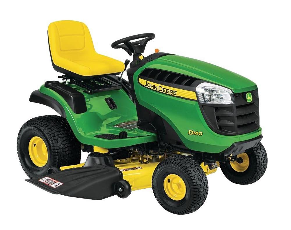
Walking into Home Depot the other day I noticed a row of John Deere lawn mowers parked out front. I knew they were John Deere long before I read the name on them because of their distinct green and yellow paint. If I didn’t know better, I’d have thought John Deere owns that green and yellow. Come to find out they don’t but it’s not for a lack of trying.
In fact, the farm equipment giant tried to trademark their signature green but was shot down by the U.S. Patent and Trademark Office. But…many other companies have been successful in “owning” a color. Surprised? So was I.
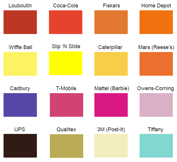
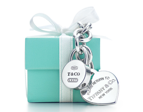
Then I learned something very interesting but not all that surprising. Those brown delivery trucks, blue jewelry boxes, and yellow sticky notes? Yep, UPS, Tiffany, and 3M have all trademarked their famous brown, blue, and yellow shades in. the idea all started back in the late 1950s when Owens-Corning sought to distinguish its fiberglass insulation from that of its competitors. Rather than go with the standard tan hue, Owens-Corning decided to make their insulation pink and went all in. They adopted the slogan “Think Pink” and used the Pink Panther as their mascot and in advertisements. It worked, and after a five year battle the company became the first in American history to successfully trademark a color in 1985. Since then many have tried and failed but others have succeeded.
Quick quiz: what’s the difference between trademark, patent, and copyright? For starters, copyrights are registered by the U.S. Copyright Office at the Library of Congress (D.C.’s most stunning building interior IMHO) while the U.S. Patent and Trademark Office grants patents and registers trademarks. In short, a trademark can be a phrase, word, or design that identifies a company and its goods and services (e.g., Campbell’s soup labels) while a patent is a granted property right to the creator(s) of a new, unique, and useful invention, discovery, or process that allows one to bar others from making, using, or selling their invention. Copyrights are different in that they protect original works of authorship including songs, books, movies, articles, and much more.
Enough school though; let’s have some color fun.
Get Tested
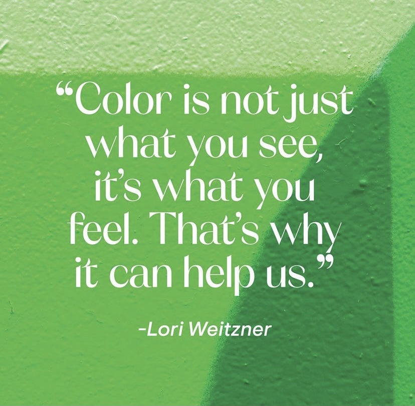
I love taking little quizzes. Personality quizzes. Likes and dislikes quizzes. Travel quizzes. The gamut. I recently took one on color and it got me thinking on how much color affects our lives, our world, and even our moods.
Textile designer Lori Weitzner identified 10 palettes in her book Ode to Color and then teamed up with a psychologist to develop an 18-question quiz that shows you which palettes suit you best. The quiz, which is available on Weitzner’s website, asks you about things like movies, books, music, sentimentality, personality, risk-taking and other interesting touch points. Again, I loved it and my results showed the “Fragrant Woods” palette suits me best followed by “Earthly.” Hmmmm…let’s look into those and the others.
Maria Flanigan
Shades like those found in a pine grove…think greens and browns…make up Fragrant Woods, are described as the colors of homecomings and hues that are nurturing and personal. They are all about slowing down, wellness, being present, and sensoring experiences like using a paper calendar or nurturing a houseplant. OMG. That’s me! The Earthly palette consists of colors like clay, sienna, and terra-cotta.
When it comes to my home décor, these pretty much hit the spot. I’ve always said I prefer coloring with the spices: paprika, saffron, basil, and cinnamon. I also love a splash of salt and pepper/black and white and tend to stay away from florals, opting instead for stripes, plaids, and checks. I also like a homey, traditional, and personal feel. Don’t get me wrong, I love home décor and design, but oddly enough when it comes to our home, I care more about comfy and cozy than trendy and styled. But that’s just me. What about the rest of the world?
Come to find out phrases like “seeing red,” “feeling blue,” and “green with envy” have some scientific back-up. In fact, study after study has shown color and mood are intricately linked and many of us actually have personal relationships with particular colors. In fact, our brains respond very powerfully to colors and one interesting study in Switzerland gave us some literal “food for thought” when it revealed people who use red plates tend to eat less. The thought is red is often associated with words like “stop” and “danger,” so our minds may put on the eating brakes when we see that color. Excuse me while I go buy some red plates…
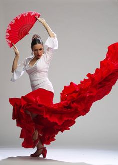
The color red also increases your heart rate and evokes powerful emotions like fear, anger, and passion. Think red flush in the cheeks, fire trucks, and even “red light” districts. It also exudes strength and leadership, as well as confidence, ambition, and an outgoing personality.
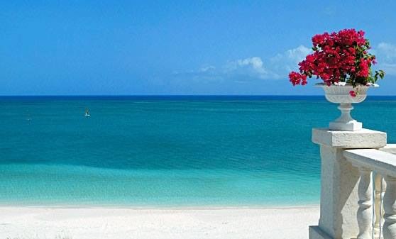
On the other hand, if you’re looking to chill out, opt for blue, which psychologically lowers blood pressure. Think blue skies and tranquil blue oceans and if you’re looking to convey a calming presence on a first date or interview, wear something blue as it is associated with trustworthiness, strength, and dependability.
Jean Stoffer Design
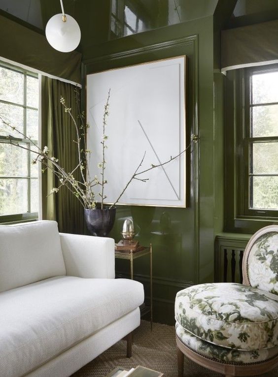
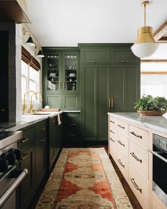
Green is considered earthy, understated, and balanced and is part of the color family chosen by Benjamin Moore, Sherwin-Williams, and Behr as Color of the Year for 2022. Rather than a bright emerald however, the paint experts went with more warm, muted tones like olive, sage, moss, and eucalyptus. On the other hand, global color authority Pantone went with Very Peri as its color of the year. The periwinkle blue lends itself to relaxing vibes and tranquil feels and boy are we all in desperate need of both this year!
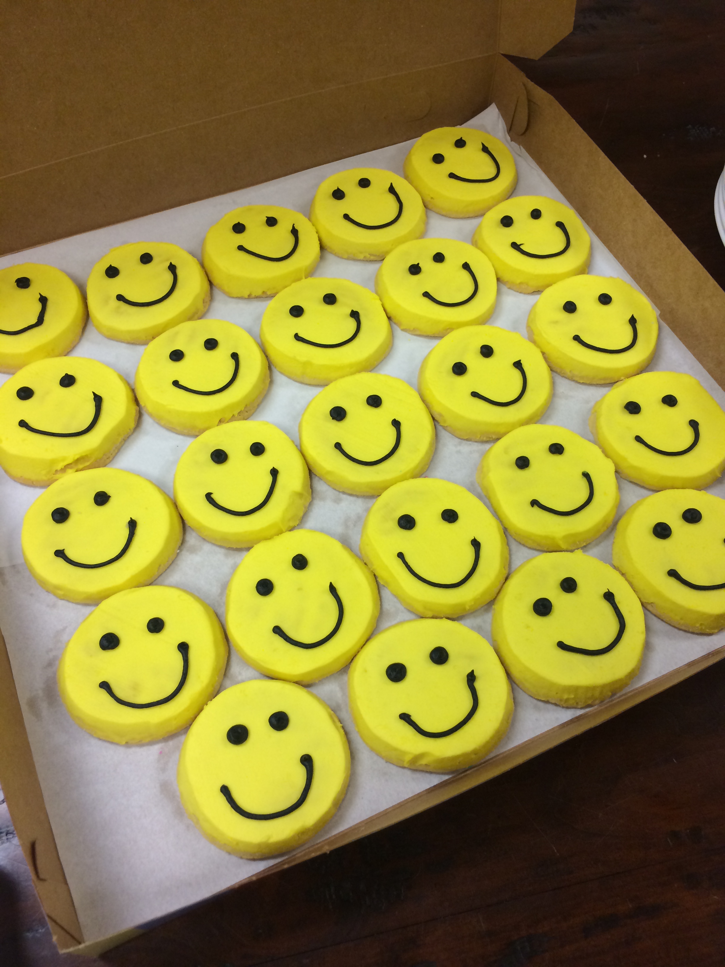
“Mellow” yellow is anything but as most consider it joyful, fun, and bright. Orange is considered a combination of yellows sunniness and red’s depth. It evokes action and is said to stimulate enthusiasm and creativity. I personally don’t wear orange but I do wear purple now and then and come to find out the rich color is associated with royalty and luxury. It evokes and can even instill confidence and can make one appear more sophisticated if handled well.
Brown and gray both symbolize practicality and sensibility as well as a certain kind of down-to-earthiness and a more low-key personality.
Then there’s black. Think making you look slimmer and that famous little black dress. It can indeed be slimming and is associated with elegance and high class. Can you say limousines and black tie affairs?
Finally, white. Pure white. A symbol of purity and simplicity. You can do so much with it!
So there you have it; a roundup of all things color. But there’s more! In my next blog I’ll share some fun facts and tidbits regarding color as well as how it can affect productivity. Stay tuned!
Discover more from Beyond Words
Subscribe to get the latest posts sent to your email.
