College football is almost here and being a huge fan, I cannot wait. But, since I promised a follow up blog to my one yesterday on color, the game of football itself has to wait but color does play a big role in the sport so let’s kick off this blog with a fun football story.
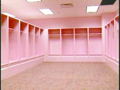
As I discussed previously, color has a huge effect on us and the color pink is often thought of as passive and calming. That, sports fans, is exactly why the visitor’s locker room at the University of Iowa’s Kinnick Stadium is painted pink! LOL right? It’s the brainchild of former coach and psychology major Hayden Fry who ordered the locker room painted pink. Everything is pink. The lockers. The walls. The floors. The toilets. Everything! It’s actually an interesting idea that I love almost as much as I love the Hawkeye’s tradition of waving to children in the next door children’s hospital during every game.
I’ve also heard of prisons using the color pink to calm their populations and there’s a reason why airplane seats are often blue. The fact that airlines across the board incorporate various shades of blue in the cabins is no accident or coincidence. In fact, it’s not so much about comfort but also about psychology.

Airline execs have researched it and found that blue is associated with the positive qualities of trust, efficiency, serenity, coolness, reflection, and calm. In today’s world of airline struggles and flight cancellation madness, we all need a little bit of calm on board, right?
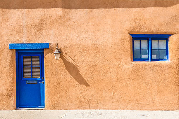 You’ll also find a lot of blue when you visit Santa Fe, specifically on doors, windows, and gates. Not only does the color go beautifully with the city’s signature tan and brownish adobe structures, it is believed to keep evil spirits from entering your home when painted on entrances to it. This custom most likely came from early Spanish settlers when they established the city but their Native American brothers also come into play. It is said that blue indicates one of the four sacred directions of local Pueblo life; the direction of the southwest. If you’re wondering, red signifies the southeast, yellow the northwest, and white the northeast. Whoever gets credit for it, I think it’s a beautiful tradition.
We’re not done with blue just yet. Many companies use blue in their logos, either front and center or in the background. Just look at your phone or tablet’s desktop icons. Facebook. Twitter. Explorer. Venmo. Blink. LinkedIn. GroupMe. The Weather Channel. PayPal. They’re all blue in some way or another. Blue is considered a rich and subtly bold color and is often associated with freedom and openness and a University of Illinois study found that people who worked against blue backgrounds scored better on tests that required imagination and inventiveness. (If you’re looking for detailed work, the study found red backgrounds are your best. No wonder I like red so much!)
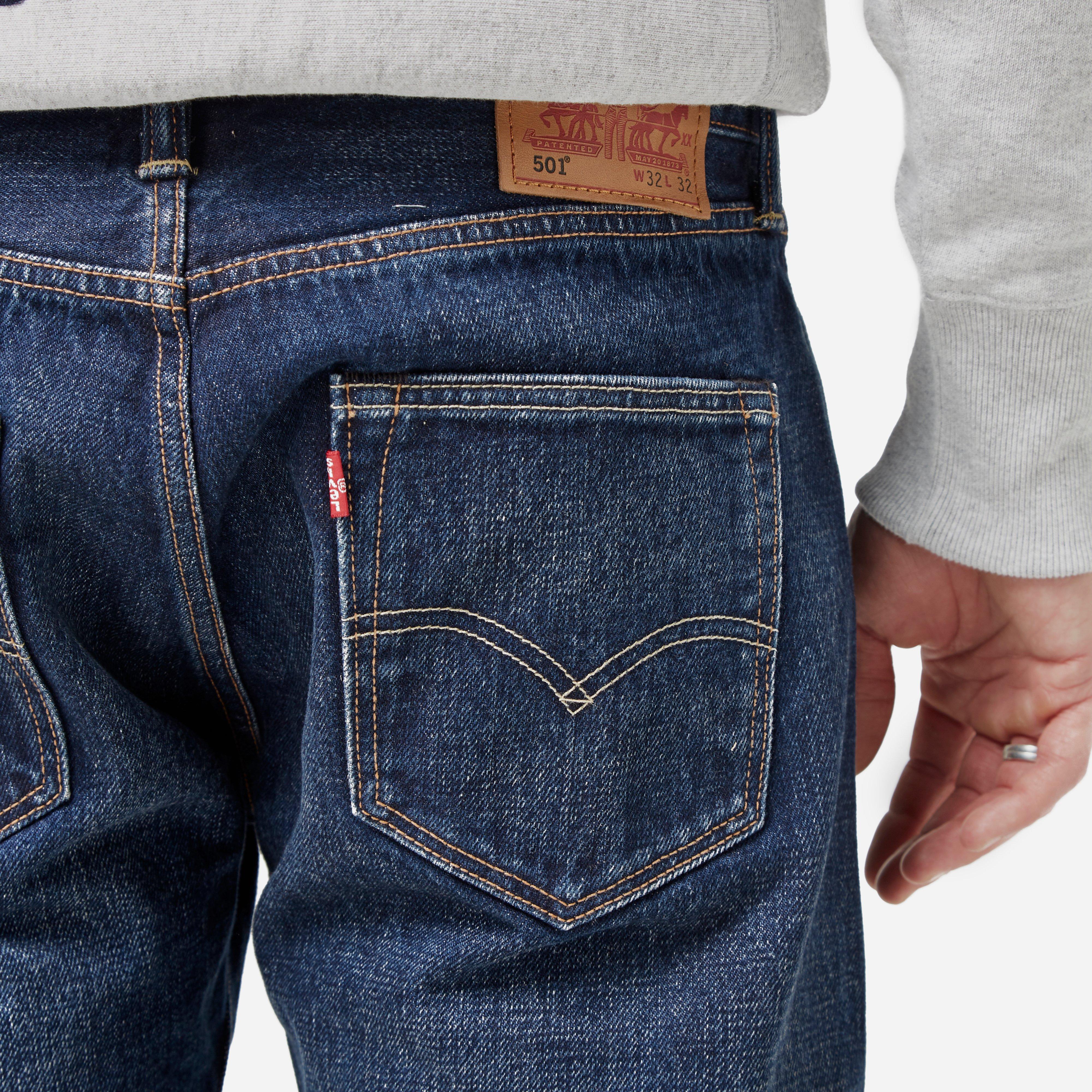 Another fun fact regarding blue has to do with something you might have on right now. Did you know the iconic jeans we all love and affectionately call “blue jeans” may be as American as apple pie but the material they were originally made of was a French fabric probably in the Middle Ages. Levi Strauss may have received a patent for reinformcing his trousers with rivets in 1873, bu the twill weave fabric often using indigo and white yarns that defined them was originally called “serge de Nimes” after the French city where it was woven. That long French name morphed into “denim” but the indigo yarns still attach to the cloth’s threads giving us those blue jeans we so love.
 Color also plays a big role in the medicines we take. It comes as no surprise that pharmaceutical companies are aware of the association colors have and incorporate the data when developing products. We all know what the “little blue pill” is, as Viagra is famously known, but did you know blue is also best known for sedatives? Look in your medicine cabinet. Check to see if red and orange ones are stimulants, cheery yellow ones are antidepressants, soothing green ones are to reduce anxiety, and white ones suppress pain. Not only do these color choices ensure manufactures don’t mix them up during packaging, they also are thought to help patients recognize what they’re taking. And yes, the drug makers ferociously protect their designs but you may find that generic versions somewhat resemble the originals.
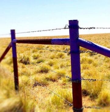
And our last “did you know” color tidbit? Purple posts and trees. Huh? Yep, many states allow landowners to paint trees and posts on their property purple. Why? To warn trespassers. Think of them as pretty “No Trespassing” signs. I actually pass one big one as I go about my daily life. Why purple? Well, for one, it shows up well outdoors and it’s one of the only colors that colorblind people can easily identify.
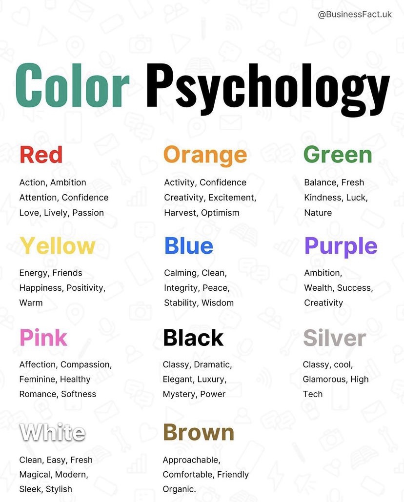
Interesting, right? So is the fact that the color of your office impacts your productivity. I realize many of us are working from home and not going into an office, but look around anyway. What color is your WFH area? You might want to know that a University of Texas study found that gray, beige, and white offices induce feelings of sadness and depression, especially in women, while restful greens and calming blues improve efficiency and focus. Yellow is the best choice for artists, writers, designers, and developers as it is believed to trigger innovation and creativity. Don’t think you have to go crazy with these colors though; you don’t necessarily need to paint an entire room yellow or blue, but think of ways to powerfully pop it in the room.
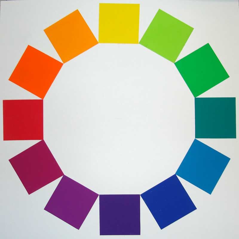
Lastly and when all else fails, stick to colors close together on the color wheel if you want a calm setting and colors that are far apart on the color wheel if you’re looking for drama. And, did you know Sir Isaac Newton invented the color wheel in 1666? Who knew the creator of the law of gravity and reportedly calculus was also a color connoisseur?
Well now you know more about color then you probably ever wanted to. I hope you liked some of these interesting and fun facts and that next time you see a blue window or purple post, you’ll know why. If nothing else, happy coloring!
Discover more from Beyond Words
Subscribe to get the latest posts sent to your email.
